
This week, I am extremely excited to be writing an article about the illustrations used in Firewords. I deal with the proofreading and editorial side of each issue so I approach the illustrations as an enthusiastic reader. This article will come from the eyes of a novice. It will describe what illustrations can bring to the ordinary reader who wants to enjoy a good story or poem at bedtime, over a cuppa, on the train on the way to work or relaxing on a park bench.
To demonstrate this, I have used a few examples from the recently published Firewords 8. Unfortunately I cannot mention all our artists below.
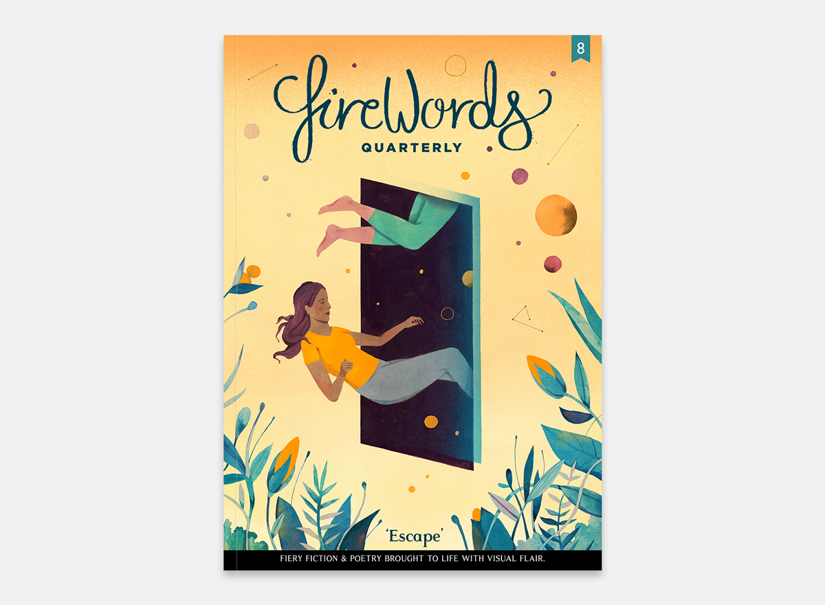
The cover art
Each edition of Firewords has a particular theme and this is encapsulated by the cover. It sets the tone for each story and poem, no matter if it is dark or light-hearted. Take the cover of Firewords 8 by Luisa Rivera, for example. There is a lightness about the way the girl is floating out (or in?) the window. This fits with the optimism in Hope and Big Life. However, it may be seen that she is being sucked into the dark night and she would really like to escape to the sunny yellow world of flowers and freedom. It takes us to the dark places of Monkey Mind and the troubled space of Legless Edbur, where escape is sought but the pull of reality is always strong and all-consuming. The cover is interpretive and this openness helps to guide us through each piece contained within. It is captivating and makes me feel like there should be a question mark after the theme of the Issue. Escape? Well... has she escaped? And will the characters who appear in various situations throughout Firewords manage the same feat?
In this way, ambiguous and interpretative cover illustrations really do bring each story to life.
Full-page illustrations
This gives artists the space to flex their creativity. However, this does not mean that they have to use every inch of space available and sometimes they are most effective when they choose not to.
For example, in the Wasp and the Willow, by Carolyne Topdjian, Wenting Li covers a page with a field in which the young girl is wheeling her mysterious wagon. It is clear that she is knee deep in grass, but the page is largely blank. The sense of distance is also highlighted by the aerial position of the observer. This illustrates her loneliness and isolation completely. Had there not been such space around her then her separation from society would not be portrayed so well. As the title suggests, this piece relates to setting and often it is by highlighting the voids that are there that creates the most effective meaning. Wenting also decided not to show the titular willow tree because it is so well described in the prose, instead allowing its ominous shadow to creep in at the top of the page.

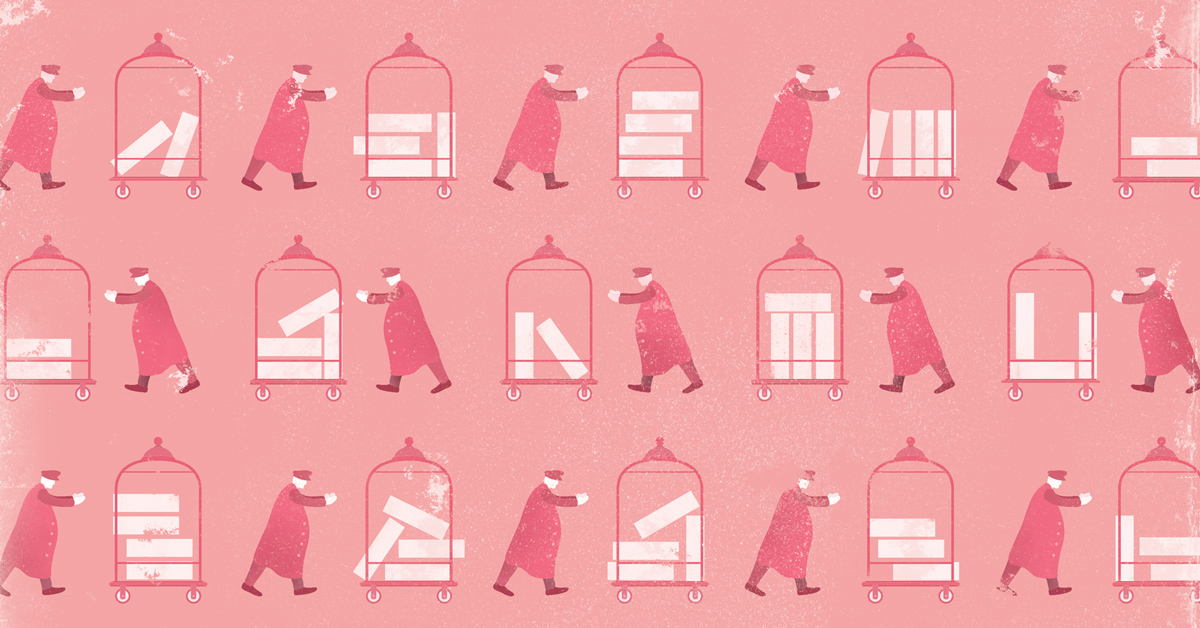
A stark contrast to this is the illustration in Mr Hilbert’s Grand Hotel, by Elizabeth Lovatt. Rondie Li’s design is face on, making us acknowledge the repetition we see straight away, and is symbolic of the mundane monotony of the tasks assigned to the workers of the hotel. Each figure is uniform and the luggage trolley varies only slightly, which reflects much of the message contained in the writing itself. The number of figures mirror the size of the hotel and creates a feeling of claustrophobia, as if the reader is sandwiched among them and cannot escape.
Spot illustrations / lettering
These two elements are more subtle than the bigger pictures out there and are not mutually exclusive. Take the title lettering for Big Life, by P.D. Walter. Dan did two things here; he included a subtle cockroach climbing up the letter G and he ensured the word ‘Big’ was marginally larger than ‘Life’. He therefore emphasised a key element of the story – that the character of Lise wanted something more for herself – and he introduced the idea of a cockroach from the start, which was to prove pivotal in the protagonist’s journey and success. In fact, each time I read this piece I notice the title and how much it foreshadows the content. This complemented the unique full page artwork created by Ming Hai, where a woman enters a door in the back of a cockroach and steps into the unknown.

Maggie Chiang also outdid herself by not only creating the illustration for the prompt competition that we ran with Bloomsbury, but she also provided stylised artwork for each of the winning stories: Last Man Standing, by Jen Falkner, and The Man With No Shadow, by Stephanie Percival. Both are black images on a circular white background, tying them thematically with each other. Still, each is strongly embedded in the story in which it is set, and the winning pieces are far different in this regard. Therefore she managed to create both similarity and difference at once. In Last Man Standing, the image is of near-ghostly footprints atop a blanket of snow. In The Man With No Shadow, a set of eyes peer out of an otherwise-featureless face. Is it the eyes of the sleep-deprived girl seeing into her future, or the eyes of the man with no shadow seeking her out? This ambiguity adds to the tense atmosphere of the piece.

I could have used many other examples of artwork from Firewords 8 and previous issues. One of the most enjoyable parts of reading each edition is knowing where to look for artwork that really brings a story to life, and knowing that I am not going to have to look too hard. It is all around, in every page, both big and small. Even from my own, non-artistic viewpoint, our artists really make Firewords what it is.
