Guillermo Ortego & his artwork in Issue 6
In this feature, we look at the design of Firewords more closely. This series of blogs will allow us to meet some of the creative talent we’ve worked with and find out why they made the design decisions that they did.
Meet Guillermo Ortego, an illustrator originally from Madrid, who took on the challenge of illustrating the short story ‘Fuel’ by Shirley Golden in Issue 6. The thought that went into his artwork and how well it represented the story made him the ideal candidate to answer some of our questions about his process.

FW: How did you come up with the initial idea for your illustration?
G: For me this was the first time illustrating a short piece of fiction and I found it especially challenging due to the amount of layers of meaning and narration in Shirley Golden’s piece.
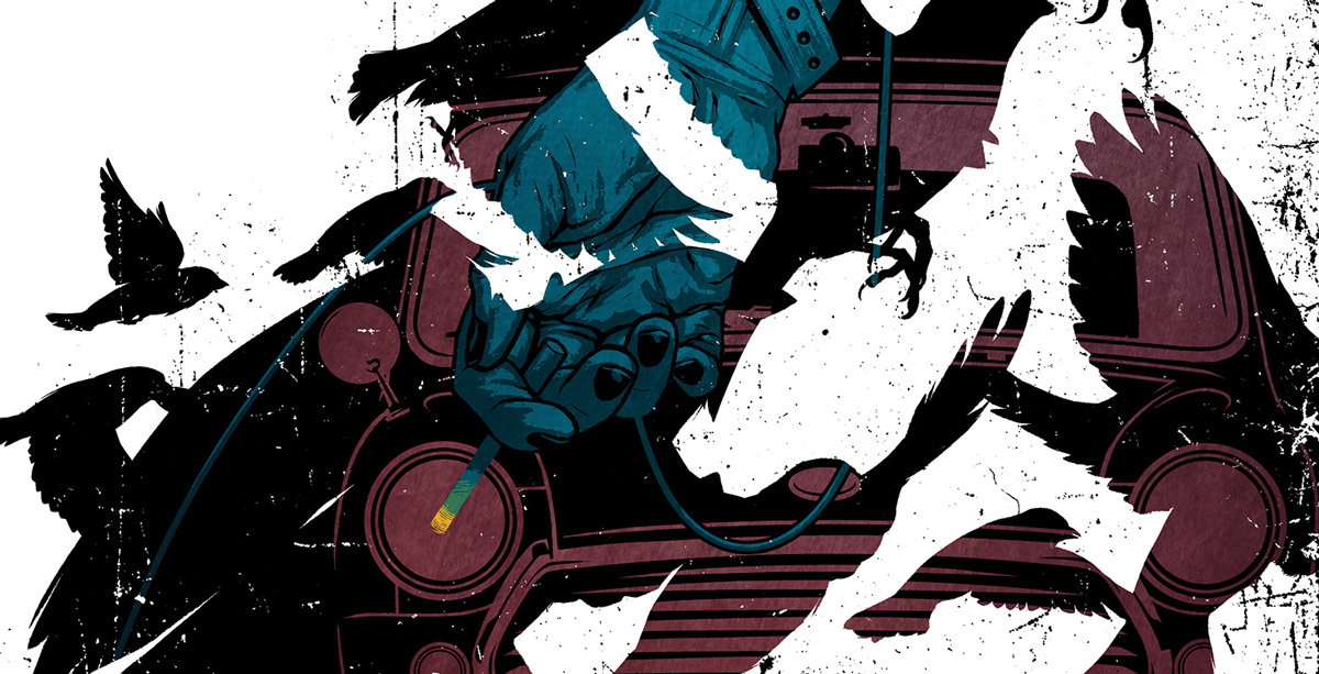
I was initially attracted by the visual possibilities of that split second in which the characters’ eyes meet in the Mini’s side mirror. However, the more I read the text I realised a simple illustration of this moment in time, or of any other for that matter, would simply be scratching the surface and failing to address the wider themes the author was playing with. I needed to visually connect the physical events at the petrol station with the personal past stories of both characters – which is where I thought the actual weight of the “action” laid on – plus that final excerpt devoid of time and location at the end of the text. The more I thought about it, the events at the petrol station became insignificant, buried by the overwhelming meaning of everything that was not said. Like in comic-books where the magic lies in the gutters between panels, that is, in everything that is not drawn; in Shirley’s story the key lies on everything that is not written down, and therefore cannot possibly be known.
At some point in between readings I realised the weird parallelism between a car being refilled, connected to the petrol pump by a hose, and a cancer patient at a hospital being connected to an intravenous chemotherapy drip, and that’s where I found that I could bridge the present with the past. So with that concept in mind I started doing the first sketches, inserting the IV drip on the hand of the woman by the car’s side mirror. If I added a cigarette to that hand I would then be connecting the events at the petrol station to those on the excerpt, and that arm could now belong to any of the three women mentioned in the text. It also made for quite an arresting image: a hand holding a cigarette, which is life-ending, whilst receiving chemotherapy, which is life-saving.

FW: How did it evolve over time and what were the refinement stages like?
G: So far I was addressing the physical events at the petrol station, the issue of illness and also the defiance of that illness and of death itself (shown by Maggie in the excerpt), but there was one major theme that I was not touching upon: that of flight, liberation, escape of one’s own circumstances or the impossibility of doing so. We see it on the woman fleeing what we assume is an abusive partner and we see it on the petrol station owner that hasn’t been able to do so, his life interrupted and frozen in time by the untimely death of his wife and that is therefore willing to facilitate the escape of a total stranger to him. And we also see it in Maggie and Hal. She wants to be free from the illness that is consuming her from the inside out and he is conflicted by the anguish and the anticipated guilty feeling of relief that her death will ultimately bring.
And here’s where what I think is the most poetic sentence of the text comes in: ‘He thinks of sparrows and flight’. It had already caught my eye on the first reading as it seemed not to fit right in with the rest of the text and so it became the perfect visual metaphor for this theme of flight or escape. It was then a matter of creating an interesting pattern of silhouettes of birds in flight that looked random enough but that allowed me to include within them the woman’s arm holding the cigarette and the hands of the doctor/petrol station owner with the IV drip/petrol hose.

FW: Can you explain how you create your artwork and how you brought this piece to life?
G: As this was going to be a tricky composition with a lot of adjusting and re-adjusting, I jumped straight to doing digital sketches on Manga Studio. This also allowed me to work directly in colour and to swap between different colour schemes with ease. Colouring is where I feel less confident, so I’m trying to make the effort of making most of the decisions at his early stage by producing colour layouts. The inclusion of the Morris Mini in the background to round-up the “layers of meaning” was a lucky result of the final composition, as the cherry of the cigarette on the bottom left corner made me think it could be overlaid with the light coming from the car’s headlights.

Once I was happy enough with the final layout and had selected a few colour-scheme options I sent them over to Firewords’ editor and designer Dan Burgess for feedback and approval and it was him, quite brilliantly, that suggested the idea of breaking the boundaries of the page and have some of the birds invade the text on the left.

After fixing the final layout for the double spread, it was a matter of producing the final high-resolution image, which was straightforward enough as all the heavy lifting had been done on the layout stage. Since the sketches were already digital, I simply blew them up to fit the final dimensions on a 400dpi file and started inking and colouring on top of them. The final textures and scratch-marks were added to give the drawing some character, as we were mostly using flat areas of colour, and to help convey a sense of agitation and movement, almost as if the birds were breaking away from the confines of the paper. Dan then took on the same scratch-marks for the general design and layout of the text, using them around the title and to separate the small excerpt at the end of the story, giving the whole thing a very nice sense of unity.
FW: Any other projects in the pipeline or current work you want to tell us about?
G: Ever since I finished my Firewords piece I’ve been helping out the Spanish newspaper EL MUNDO with a small revamp of their online and paper editions. I am producing a set of what will be 50 portraits of their members of staff and most usual collaborators. At the date of writing this I’m on portrait number 33, so not that long to go until the whole project is completed and sees the light of day! In between portraits I did manage to illustrate the cover for June’s issue of Actualidad Económica, a Spanish economics magazine, which should be on the newsstands by now.
FW: Where can our readers see more of your art and find out more about you?
G: Probably the best option is to check my Instagram or Twitter accounts, where I try and post regular updates of work in progress and behind the scenes shots which I always find are the most interesting of an artist’s work. Alternatively, my website is a good a place to get an overview of the illustration and comic-book work I’ve done so far.
If you enjoyed this post, check out the last case study we did with Brooklyn artist Christina Chung about her artwork for the cover of Issue 5.
Leave a Reply