We wanted something special for the cover of our 10th issue (copies still available here) and with the theme of ‘Curiosity’ we know Guillermo Ortego was the man for the job. We’ve worked with Guillermo on several illustrations for Firewords in the past and we were always impressed by the care he puts into his conceptual thinking as well as his craft. The amazing wraparound cover he created for Issue 10 is below and in this guest post he shares some of the details you may have missed…


Guillermo Ortego: Looking back at 2018, which was a pretty busy year in terms of work output for me, the wrap-around cover I illustrated for the 10th issue of Firewords still stands out as my favourite. I guess it mostly has to do with the fact that, in its inception, the idea that ended up making it to print was that weird-layout-option-you-always-include-but-the-art-director-never-selects-because-it’s-too-risky. The fact that Dan was bold enough to break with the consistent visual aesthetics of past covers to produce something different to celebrate the magazine’s 10th issue still fills me with joy.
Initial concepts
The truth is that it wasn’t an easy theme to try and represent in a single image. For me, the starting point was this idea of placing curiosity at the heart of everything that makes us human. Curiosity is at the heart of all knowledge, and without it, there would be no arts, no science, no culture, no civilisation, to use a bit of an old-school concept. Some of my initial sketches stemmed out of this positive, heart-warming and optimistic approach, and they were more in line with the feelings past covers of the magazine had evoked.
I also considered a more cynical take on the subject, and it involved making the cover look like a Google homepage, to represent the fact that every doubt, question or query that sparks our curiosity in our day and age will almost certainly be filtered by Google and the internet, that have, in a way, kidnapped knowledge at the same time as making it widespread and easily available. From a design and concept point of view, it was a strong image, but the bleakness of the message might not have been in line with this heart-warming feeling the magazine tends to have.
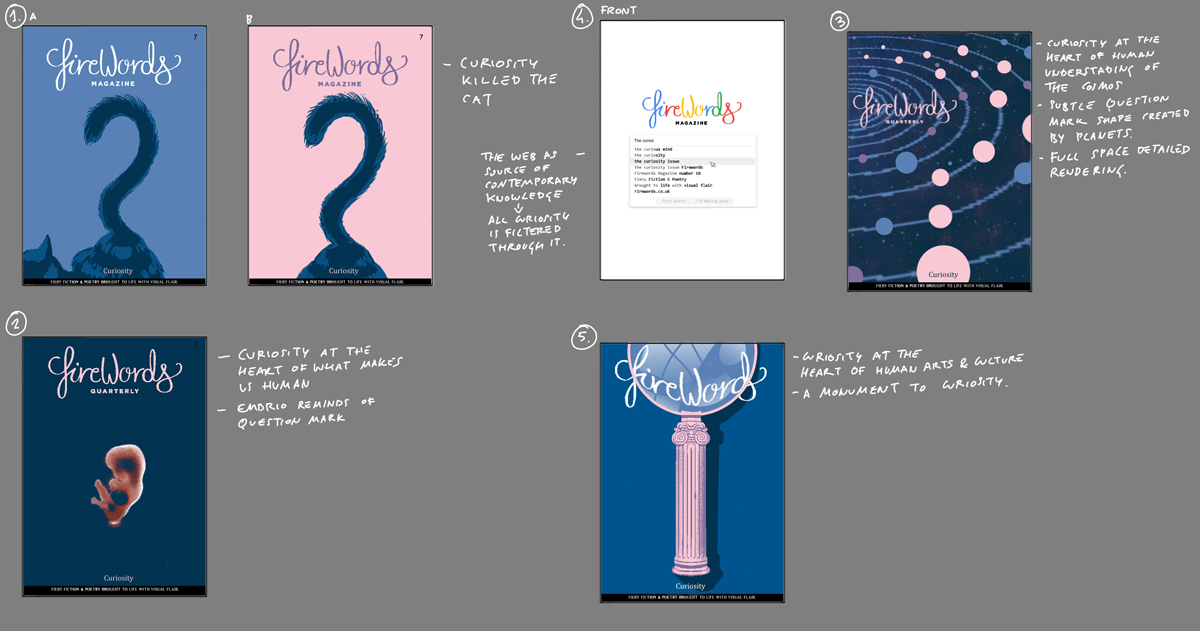
The winning concept
Equally weird from a design point of view was the idea that ended up being the winner, as it broke completely the traditional layout for the cover and back cover. The idea came from this strong image of a closed box that came to mind whenever I thought about curiosity. For me, getting the post at home through the letterbox is probably one of the highest peaks of curiosity my brain experiences on an average day. When you hear the parcel come through, you simply have to go and open it. You’re dying to know what just came in through the door. So I wanted to try and recreate this same feeling of curiosity and urgency with the cover itself by making it look like an envelope that has travelled many miles before it reached your hands. What better way to illustrate a feeling than by provoking it in the reader’s minds? At least that was the idea. And actually, it would work on a further level, making the concept extra “meta-“, as most readers would be getting the magazine through the post, therefore we would have an envelope inside a real envelope, so the magazine would become both the content and the container at the same time.

But of course, it was a concept that created a cover that was very interesting to look at, regardless of all this theoretical talk. On the one hand, it would definitely stand out in the newsstand when stacked amongst the rest of the ordinary-looking magazines but it would also contain so many details to look at, between stamps, different typefaces, different messages enticing you to open it, etc. All these elements offered the perfect opportunity to fill the cover with all sorts of Easter Eggs and hidden trivia about the magazine’s journey from their early days after the successful Kickstarter campaign that started it all in 2014 to their 10th issue four years later.

The most evident nod to the past was to include all previous nine covers of the magazine in the shape of stamps, but we also managed to include all the following data:


-
Number of submissions the magazine had received: 5500+
-
Number of countries submissions had been come from: 89
-
Number of writers published: 200
-
Artists collaborated with: 129
-
Gender split of published material: Female 55% / Male 45%
-
About the original Kickstarter campaign:
-
Date of launch: 19 Mar 2014
-
£1,668 Pledged
-
139% funding raised
-
-
Number of magazines printed so far: 4825 – This became the registration number for the parcel.
-
I wanted to make explicit reference to travelling by including as many stamps from different countries as possible since it’s something the guys behind Firewords made reference to on their interviews, bios and podcast, and also because the magazine has reached people all over the world. The main places associated with Firewords are Glasgow, Scotland and Toronto, Canada.
-
The dates in the stamps also had meaning, such as the release date of the first issue and the date the editors, Jen & Dan, got married.
-
The “address” on the cover was handwritten by Dan Burgess, editor, art director and designer behind Firewords.
-
I also tried to include as many customs stickers and stamps as possible, from the blue Japanese one to the Firewords logo as well as all the FedEx-looking labels that included the usual back cover information: From information about the cover artist info to submission advice for writers and artists.
-
All other missing back cover information, like the back-issue-availability and the magazine’s website, were included as “handwritten” notes to resemble what delivery men sometimes write on parcels.
-
The barcode displayed on the envelope is the real one for the magazine.
It’s quite surprising to realise the amount of relevant information we managed to fit inside the illustration which I guess also helped in making the cover quite rounded on all fronts. It works on a conceptual level, as it engages with the theme it’s trying to portray; on a purely aesthetic one, as it’s pleasant to look at but it’s not simple eye-candy, as there’s meaningful content to each of the elements drawn on the cover.
Born and raised in Madrid and currently living in London, Guillermo Ortego has been inking comic books and illustrating books and magazines ever since he completed a degree in History in 2009. You can see more of his work at willortego.com.
Leave a Reply